ThinkGeo.com    |     Documentation    |     Premium Support

Legend Item Overlap

Hi,

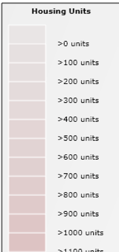
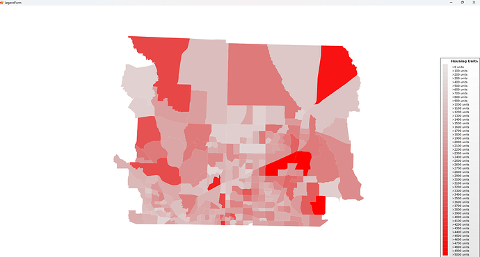
I’m adding legend items as area styles to the legend adornment layer to create nice blended scales. But, I am finding that when I set the image height smaller in order to get a broader spectrum of colors that the image width automatically resizes itself to match the height adjustment. And, if I alter the image width to a larger number, the height is overridden and then the legend items overlap. Here are a couple images.

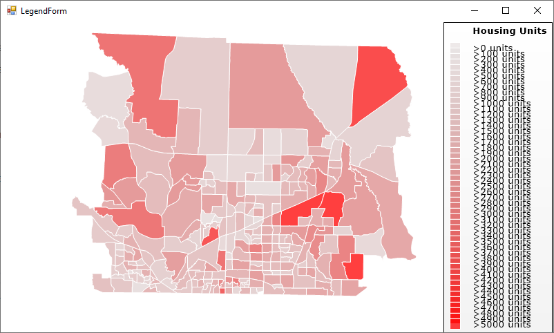
This is when I set image width greater than image height. Note the overlap.

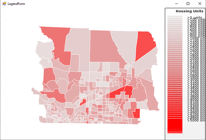
This is when I set image width and height equal. There is no longer any overlap in the colors, but notice that the legend items get progressively smaller and smaller.

The legend item width and height properties do not seem to have any effect on this. It’s like the legend item must be a square.

Ideas?

Regards,
Damian

Hi Damian,

I couldn’t recreate your issue. Here I created a demo for you, please have a look.


LegendIssue.zip (735.6 KB)

Thanks,
Ben

Ben,

We are using version 10 and Winforms.

Your project wouldn’t build. I get this error. I’m not a WPF guy, so not sure.

Severity Code Description Project File Line Suppression State
Error The tag ‘MapView’ does not exist in XML namespace ‘clr-namespace:ThinkGeo.UI.Wpf;assembly=ThinkGeo.UI.Wpf’. Line 11 Position 10. LegendIssue MainWindow.xaml 11

Regards,
Damian

Any update?

Regards,
Damian

We couldn’t recreate your issue. Here’s a v10 demo. HowDoI.zip (750.2 KB)

Actually, your example shows exactly what issue I am having just by making a few tweaks…

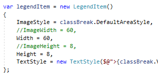
I haven’t quite figured it out, but there is a very big difference between setting ImageWidth vs. Width and ImageHeight vs. Height properties of LegendItem. It’s like they have different units.

First thing about your code if you run it as is, that you aren’t displaying all the boxes as you can see you have no bright red as is shown in the image and the scale stops at 3400 instead of 5000. You need to reduce your number of class breaks to have enough room to fit in the box at least with the current settings.

Now try and change ImageHeight in your example. Doesn’t matter what you change it to, the box height does not change. Only if you change ImageWidth does the box height get a bit smaller.

Next, if you set ImageWidth to a smaller number like 20, you see that the legend items start having gaps and the image height/width ratio is now closer to 1:1.

You don’t set Width or Height either. Look what happens when I alter your code to use Width and Height instead of ImageWidth and ImageHeight.

image

And if I set both sets of values I get something even weirder and the text no longer lines up with the corresponding boxes.

For my results, I need my legend items to merge seamlessly with no space between them and no overlap. All the legend items heights must be set to fit the available scale area if the user is not in full screen and the text must align to the correct scale break color.

We need to know what is the difference between Width/Height and Image Width/Height.

Regards,
Damian

hi @Damian_Hite,

Thanks for your code, we’ve reproduced your issue.

You’re right. The image of Legend Item must be a square. We can change it by creating a CustomLegendItem, and we also need to change some properties of CustomLegendItem, you could find it in the attached sample.

This is how it looks like:

HowDoI-Fixed.zip (737.8 KB)

Regards,
Leo

Thanks Leo,

The custom class does the trick. I see as well no need to set the Width property at all.

Thanks,
Damian

Thanks @Leo_Liu!

Damian, just let us know if you see any more issues.