Hi,
I am using Thinkgeo desktop edition 9.
I have a problem in displaying point text in best place.
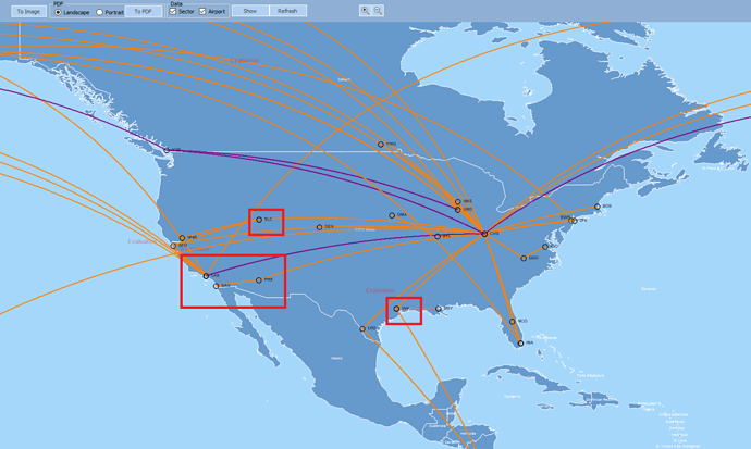
Actually I have Airports(point layer), and Sectors(Line layer) added in Map. I am applying a text style to the Airports displaying Airport name. But those airport names are not exactly displaying in best place. It is displaying like one on another and overlaying on Lines. But there is so mach free space in map where I need to show.
Here is my code for Point Text style.
InMemoryFeatureLayer im1 = new InMemoryFeatureLayer();
TextStyle pttext = new TextStyle(“Point”, new GeoFont(“Arial”, 8, DrawingFontStyles.Bold), new GeoSolidBrush(GeoColor.FromArgb(255, 0,0,0)));
pttext.XOffsetInPixel = 10;
pttext.DuplicateRule = LabelDuplicateRule.NoDuplicateLabels;
pttext.BestPlacement = true;
im1.ZoomLevelSet.ZoomLevel01.DefaultTextStyle = pttext;
im1.ZoomLevelSet.ZoomLevel01.ApplyUntilZoomLevel = ApplyUntilZoomLevel.Level20;
And here is my problem shown in Snapshots
In the above image the red squares contains wrong way of displaying Airport names. I need to visible it in free space but not on the top of lines. Its my client’s requirement.
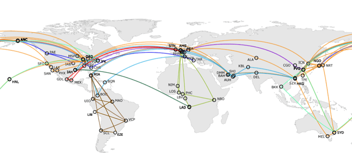
I actually want to show as follows.
I have tried some custom style also, but not working out well for me… Is this problem resolved in latest update? (OR) Please give me some solution for this …
Thank you…
Ashok


